BRIEF
Historically, NCR Point-of-Sales System clients have been managed through a hands-on sales process. This makes sense when the customer is McDonald’s or Target and a single sale will amount to millions in revenue. However, this type of client relations is too expensive and cumbersome for small businesses.
NCR wants to close this gap with a robust web based e-commerce experience tailored for the small business customer interested in NCR Silver — a small scale POS system and software designed for independently owned restaurants, small franchises, and retail boutiques.
Our challenge was to redesign NCR Silver’s existing online platform and optimize it to meet the needs of the small business owner.
MY ROLE
Research synthesis
Low-fidelity wireframes
User testing
High-fidelity mockups
PROCESS
Scope & Investigate - Understand stakeholder goals, understand user needs, conduct field research and in-person interviews, synthesize with affinity mapping, conduct a competitive analysis, develop personas and a user journey.
Ideation - Feature prioritization, redesign site map, develop user flows, sketch, paper prototype, create low-fidelity wireframes.
Design & Refine - wireframe iterations, create high-fidelity mockup, finalize clickable prototype.
Understanding the Scope of the Project
Business goals: Stakeholders wanted to update the NCR Silver online experience to provide users with an intuitive buying experience that included a guided buying feature, a guest check out option, and order tracking.
Constraints: We were given a three week timeline, during which we would need to deliver a modular component design optimized for Adobe Experience Manager, built in Sketch and prototyped in InVision.
What We Need to Know: What factors do users consider when purchasing a small business POS system? What are competitors doing? How can NCR differentiate? What do users need in an e-commerce experience? What solution will maximize business and user goals?
Contextual Inquiry
To jumpstart our research process, we used contextual inquiry and field research to understand how small businesses utilize point-of-sale systems and what NCR Silver customers were looking for in an e-commerce experience.
Results
10 small business owners and managers were interviewed in total. Most chose their POS system based on price and administrative and logistical features like inventory tracking and employee scheduling. Interviewees also reported that they accessed customer support at least once a week. In general, interviewees valued transparency in pricing and feature options and were put off by cumbersome checkout processes.
Finding Patterns
We synthesized our contextual inquiry findings using an affinity map. We identified patterns in our research by developing a series of user problem statements that reflected the needs, goals, and frustrations of our interviewees.
Personas
We used our problem statements to develop two personas — Greg represents the small business owners we interviewed who are responsible for making decisions like which POS system to purchase. Claire represents a manager of a small business who interacts with the POS system on a day-to-day basis.
Competitive Analysis
From interviews and market research, we identified NCR Silver’s top competitors: Square, Shopkeep, Revel, Clover and Shopify. A competitive analysis revealed four key areas where NCR Silver Online could differentiate:
Large product images
Product comparisons
Transparent pricing
Guided buying options
Feature Prioritization
In order to determine a minimum viable product, we ranked possible features based on business impact and user impact. We then plotted features onto a matrix as a way to visualize our priorities moving forward. Highest priority was given to features that would maximize business and user impact.
Site Map + User Flow
We created a site map of NCR Silver’s Existing site to identify user drop-off points. We found that the existing site was dense and difficult to navigate. We used user flows to compare the efficiency of NCR Silver’s old side and our updated solution.
Old User Flow
Updated User Flow
Initial Sketches
Many users expressed a desire to easily compare features and hardware, so we prioritized layouts with modular components, nested/accordion elements, and single, scrollable pages.
low-fidelity wireframes
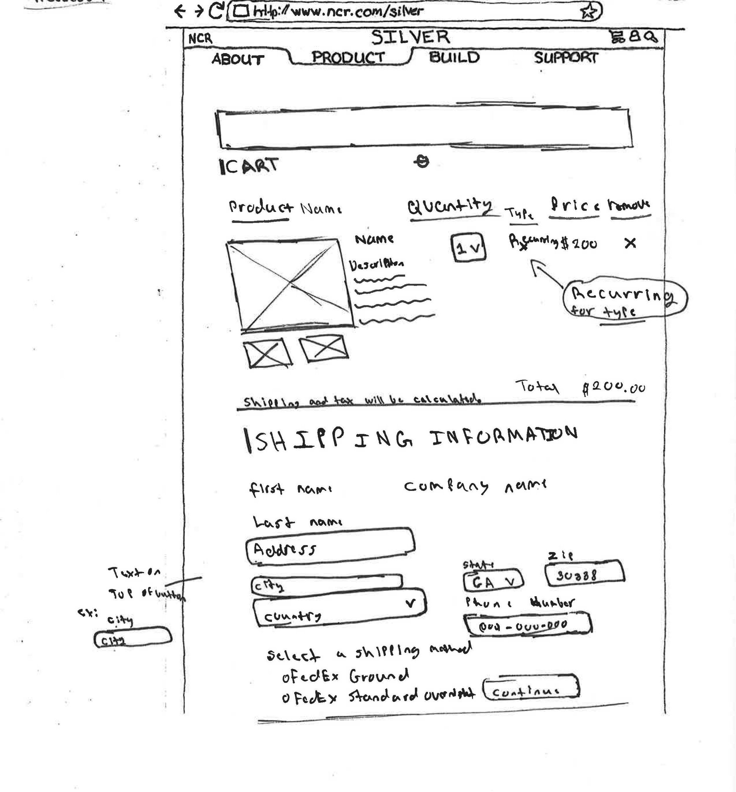
We used the following low-fidelity wireframes to conduct a series of user tests with our target audience. We focused on creating robust flows that reflected user and business goals, including a guided buying feature, suggested product pages, a complete checkout process, order tracking, and a landing page.
A/B Testing
We conducted A/B testing on our guided buying feature to understand what would be easiest for users to follow. We experimented with the placement of upcoming questions and suggested products. Based on feedback, we decided to hide upcoming questions to reduce cognitive load and break out the question review from the final suggested products page.
Option A
Option B
Final Design
High-Fidelity MockUp
Our high-fidelity mockup incorporated design elements from NCR’s branding guide and color palette. We used NCR Green to lend affordance to certain call to actions and strategically balanced visual elements with white space to maintain a clean, professional aesthetic.
NEXT STEPS
User test hi-fidelity prototype
Build out additional features like tutorials and interactions
Refine visual style
Hand off for development


